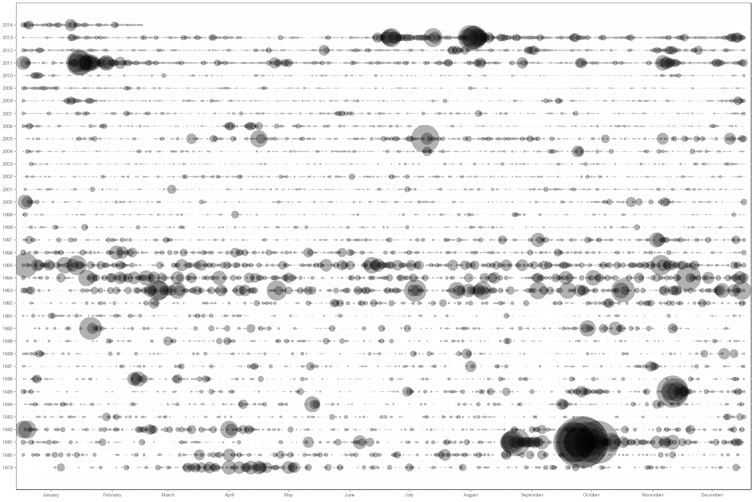
GKG Timeline Visualizer

Dataset: Global Knowledge Graph
Description: Creates a unique gridded timeline showing intensity by day of matching records - Y axis is year and X axis is day, making anniversary behavior instantly visible.
Components: PERL, R
The GKG Timeline Visualizer allows you to create a unique gridded timeline visualization from the GDELT Global Knowledge Graph (GKG) to understand temporal patterns in your data. In this visualization the X axis represents each day of the year from January 1 to December 31, while the Y axis represents each year of the data (currently this only goes back to April 1, 2013 for the GKG). Thus, rows represent years and columns represent a given day across years. At each grid cell a semi-transparent dot is displayed, sized based on the percentage of all GKG records from that date that matched your search criteria (thus these timelines are normalized against GDELT's exponential growth over time). The compact nature of this visualization allows you to spot temporal patterns at the daily level, whereas with a traditional barchart or line graph timeline, the individual bars or line points would be too small with this many points to see anything. In addition, the unique gridded nature of this visualization allows you to rapidly spot "anniversary recurrances" in which surges of certain activities or discussion occur each year around a specific date that is an anniversary of a major event in that country's history.
No programming or technical skills are required to use this timeline visualization - you simply specify a set of person or organization names, locations, or Global Knowledge Graph Themes, along with an optional date range, and the system will automatically search the entire Global Knowledge Graph for all matching entries and compile the final timeline. Your results will be emailed to you when complete, usually within 10 minutes, depending on server load and the time it takes to perform the necessary calculations. All GDELT Global Knowledge Graph records are scanned for your search parameters and the average prevalance of matching records is averaged by day. Thus, selecting "Nigeria" as your search criteria will generate a timeline of how much coverage monitored by GDELT focused on Nigeria each day, as well as a .CSV file with the results for import to an external statistical package.